Blog Series: Data is Your Friend!

Part 3: How to Effectively Report Outcomes — Dashboards

Wow, we’ve accomplished a lot of great work to get here! We identified a meaningful goal (Increase Graduation Rates by 5% this year), determined which lead metrics to focus on (Staff/ Student Connection through attendance and student response rates), found an efficient tracking method (Pulse), and created appropriate benchmarks for the lead metrics. Now we are ready to begin presenting results to staff members, and centrally monitoring them.

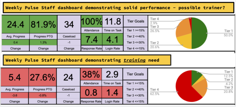
Pulse has a dashboard system built into it to help accomplish this task now, but for a long time this school prepared weekly dashboard reports through data exports from Pulse and Google Sheets. They were very happy when Pulse was able to do that work for them!  Let’s take a look at what those dashboards look like.

The two dashboards above represent two different staff. One is struggling and the other is flourishing. Can you see the differences?

Let’s evaluate the top dashboard. This dashboard is demonstrating some great results. The staff member’s students were able to complete 24.4% of their course on average that week, which was 81.9% of their goal. In other words, they fell just shy of reaching their goal of completing the percentage of the course the school established (30%). They have a caseload of 34 students and had 100% attendance that week. Their Response Rate indicates that students have contacted the staff member 7.4 times that week – more than once a day for a 5 day week. Through that connection they were able to motivate their students to log in an average of 4.1 times in a 5 day week, and spend 11.8 hours working on tasks in their class. Note the color coding (green) on those metrics. They hit the ‘highly effective’ rating from the benchmarks. The progress wheel shows the percentage of students on this caseload reaching 100% of the goal for the week(50%), between 99% and 50% of the goal(20.6%), less than 50% but some work was completed(26.5%), and 0 work was done(2.9%). This staff member is performing exceptionally well. 

Now let’s evaluate the bottom dashboard. This dashboard is demonstrating some poor results. The staff member’s students were able to complete 5.4% of their course on average that week, which was 27.6% of their goal. In other words, they fell well below reaching their goal of completing the percentage of the course the school established (30%). They have a caseload of 24 students and had only 38% attendance that week. Their Response Rate indicates that students have contacted the staff member .8 times that week – less than once for a 5 day week. There appears to be a lack of connection as they were only able to motivate their students to log in an average of 1.4 times in a 5 day week, and spend 2.9 hours working on tasks in their class. Note the color coding (red) on those metrics. They hit the ‘ineffective’ rating from the benchmarks. The progress wheel shows the percentage of students on this caseload reaching 100% of the goal for the week(12.5%), between 99% and 50% of the goal(4.2%), less than 50% but some work was completed(20.8%), and 0 work was done(62.5%). This staff member is having a very difficult time. An administrator should make a plan to visit this staff member and find out what is happening very soon. Results like this over time create drop outs and failed classes. An evaluation should be made to determine what supports are needed for this staff member to help them reach better results.

Once the dashboards started populating and reporting results, staff members were initially concerned, and their questions were legitimate. 

  • “How are you interpreting this data?”
  • “Will I be reprimanded if I don’t hit the benchmarks?”
  • “Will you be comparing my results to everyone else and ranking me?”
  • “How will this affect my evaluation?”

Those are just a few of the questions that administrators received. The school entered the beginning of year professional development with a plan to address these questions. During professional development they introduced the dashboards and walked them through what they were illustrating. It was also heavily emphasized that the results would only be used for training purposes during the first year and individual goals would be created for each staff member based on their current statistics. Only after a full year of training and monitoring would the results tie back to staff evaluations and merit pay calculations.

That year, training and coaching was the main focus, and much was learned about how best to integrate the data into school and staff management practices. We’ll discuss that in our next blog. Next: Incorporating Benchmarks and Staff Outcomes to Incentive Programs and Staff Evaluations

chris

Since 2011 Chris Loiselle has worked as building administrator, CFO, and Chief Strategic Officer for Success Virtual Learning Centers and Berrien Springs Public Schools, where he is currently filling the Director of Quality Assurance role. While working at Success, Chris was instrumental in the development of the Pulse student support software. His passion is working in K-12 managing e-learning centers and building software to help improve virtual learning outcomes.

Chris has presented on this student data topic at the 2022 Digital Learning Annual Conference and will also be presenting at Quality Matters’ 2022 QM Connect conference November 6-9 in Tuscon, AZ.

His goal is to be able to help people prosper and succeed in today’s challenging educational environment.

See the product behind the blog! Request a demo today.